After 5 long years, I finally updated my website.... now what?
My website has gone mostly ignored over the past few years. It's ironic and a little sad, because I'm a web developer and this is my "thing". In my own defense, I'm doing this sort of work at least 8 hours a day, 5 days a week. The last things I feel like doing once I get home is working on another website. But my website plays a pretty big part in getting other things I enjoy doing online. There's not much else to do with my free time while quarantine is going on, might as well dedicate some effort towards completing this goal.
Approach
My previous website was so old and unmaintained I couldn't avoided a full rebuild. I also have different needs in a website than I use to. I primarily highlighted art in my old design. But it was really old art I can't say I feel very proud of or in touch with anymore. I also threw some development & design items into the mix randomly. I was left feeling my site didn't have clear focus or direction. I wanted to make a clear definition between my interests and different areas of this site. That's part of why I kept my homepage so simple. I don't really want to overwhelm a visitor with previews of random bits of mixed content on one long page. Who is honestly gonna scroll for that? There are three simple options of items to view; My art, my thoughts or my ambitions. Gallery, Scrapbook and Projects.
Gallery displays the visuals. Oddly enough as an artist, I'm not very good at sharing things. I'm terrified of putting things out in the world sometimes, though I can't say for sure why. I've set things up as a collection of what I've done that I can easily be looked back on. The primary focus is imagery and not so much a bunch of text about a piece. Individual pages per piece seemed unecessary.
Scrapbook is more the "blog" section of my site. I've traditionally always called my personal blogs "scrapbooks". It just feels more like what I'm going for. I normally post things I want to look back on and remember for one reason or another.
The rest of the site is rounded out with Projects. I have a habit of starting a bunch of different projects and never finishing. I also very rarely share things I'm working on, so from the outside looking in, I don't think it appears as though I've got much going on. This whole pattern is rather annoying. So the Projects section of my site gives me some accountability. If I want to work on a project, it needs to go online and I need to update my Project pages as I progress. In this way, I'm really only going to put something up that I feel confident I'll come through on. I may add in a few past projects though, just so they have a place to live that's visible.
Development
The biggest change is a switch in CMS platform. My previous site was build on Wordpress oh so many years ago. I don't have anything against Wordpress, it powers 30% of the internet for a reason. However, I'm not a fan of having to bend a blogging platform to act as a full blown content management system when it's really not what it was built for. It's either that or I make my site structure work as a blog. I'm also not into relying upon an inevitable ecosystem of Wordpress plugins to maintain everything.
For this rebuild, I put Ika on FusionCMS, a "content first" focused CMS powered by Laravel build by my current company. The decision to use this was easy, not only because this is the platform I use at work, but because I can make the site architecture all my own and work the way I need in comparison to Wordpress. Front end is built using Laravel with Blade (PHP) and Bootstrap as my CSS framework. I would really love to rebuild as an SPA in the future using Vue, but the API currently does not support what I would need in order to accomplish this.
Design
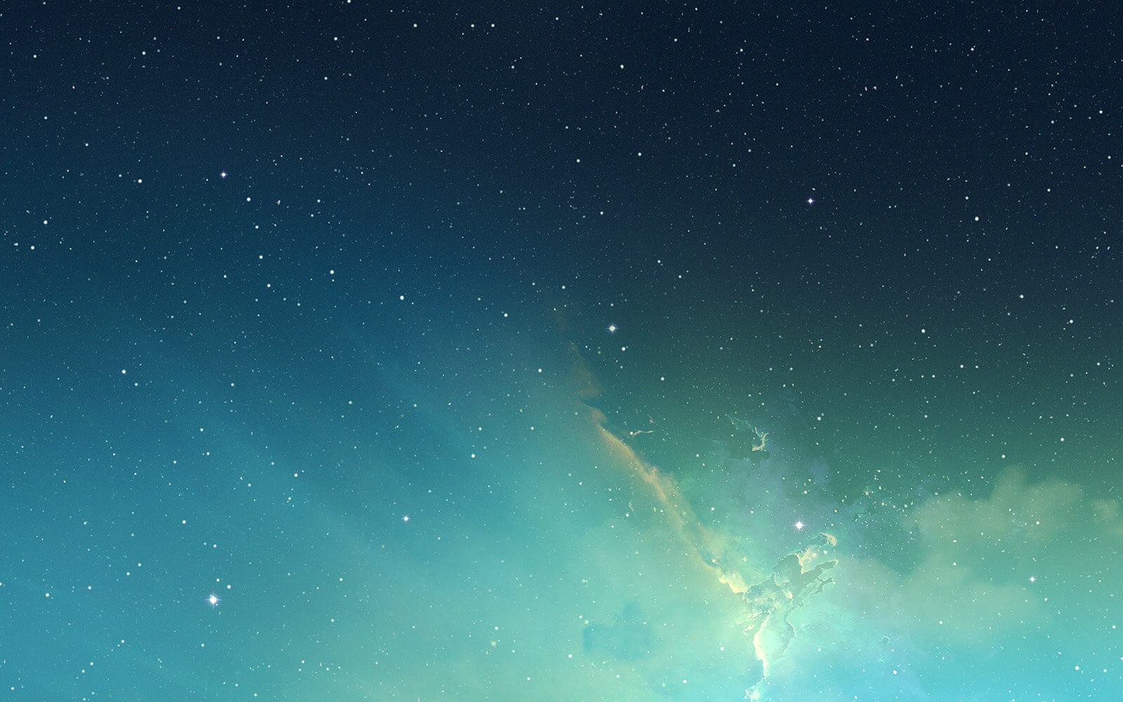
I kept a very similar color pallet to my previous design with blues, greens and accents of peach. But the composition of the design itself feels more professional. The combination of colors, fonts and basic typography remind me a bit of a school composition notebook. I'm very comfortable writing in notebooks. In a way I wanted to make my site feel familiar in that sense. And I'm a sucker for a star chart, it's a really cool and clean aesthetic to me. I enjoy combining space and underwater themes in general, so while I'm channeling only space vibes right now I'd for sure like to integrate something aquatic in down the line.